Analyzing Monthly Changes A PowerShell Approach to Data Visualization

Analyzing Changes: A PowerShell Approach using Excel for Data Visualization
-
Overview: In today’s data-driven environment, analyzing and visualizing data changes over time is critical for informed decision-making. This article explores a concise PowerShell script designed to process monthly data and output it into an Excel file, enhancing our ability to interpret changes effectively.
-
Importance: With organizations increasingly reliant on data for strategic insights, the ability to quickly visualize performance metrics has never been more essential. PowerShell offers a robust platform for automating data manipulation tasks, enabling analysts to focus on interpretation rather than routine processing.
Understanding the Monthly Data
-
Data Input: The PowerShell script begins by defining monthly data changes between two consecutive years (2023 and 2024). Each month has associated values representing performance, allowing users to observe trends and shifts in metrics.
-
Data Structure: The code utilizes a simple CSV format read directly into a PowerShell object, making it easy to manipulate and export to other formats.
-
Comparative Analysis: Change percentages are calculated for each month using the provided values, facilitating a quick assessment of whether performance is trending up or down year-over-year.
Exporting Data to Excel
-
Excel File Creation: The script initializes an Excel file, ensuring any existing file is removed beforehand. This is crucial for maintaining up-to-date reports without manual intervention.
-
Data Exporting: By leveraging the
Export-Excelcmdlet, the script seamlessly transfers the monthly data into an Excel worksheet, formatted for clarity and ease of use. -
Formatting for Readability: The script applies formatting rules to enhance the presentation of data, such as bold text and background colors, thus improving user engagement with the Excel output.
Enhancing Output with Formatting
-
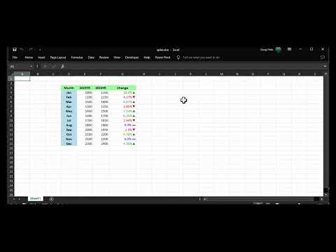
Color-Coded Changes: The script employs customized cell formatting to signify increases and decreases in performance visibly. Positive changes are indicated with green, while negative changes appear in red, allowing for at-a-glance assessments of trends.
-
Number Formatting: Utilization of custom number formats within Excel allows for easy interpretation of percentage changes, making it straightforward to discern significant fluctuations.
-
Final Touches: The script automatically sizes columns and opens the Excel package for immediate review, maximizing user convenience and operational efficiency.
Code Explanation
The provided PowerShell script efficiently processes and visualizes monthly performance data in Excel, demonstrating key functionalities and strategies for automation:
$data = ConvertFrom-Csv @"
Month,2023YR,2024YR,Change
Jan,1000,1100,0.10
Feb,1200,1150,-0.0417
Mar,1500,1600,0.0667
Apr,1300,1250,-0.0385
May,1400,1500,0.0714
Jun,1600,1700,0.0625
Jul,1700,1650,-0.0294
Aug,1800,1800,0
Sep,2000,1950,-0.0250
Oct,2100,2200,0.0476
Nov,2200,2200,0
Dec,2300,2400,0.0435
"@
- Data Import: The script uses
ConvertFrom-Csvto read the given inline CSV data, which represents monthly performance metrics over two distinct years.
$xlfile = "$PSScriptRoot\spike.xlsx"
Remove-Item $xlfile -ErrorAction SilentlyContinue
- File Management: It specifies the Excel file location and ensures that any previous versions are deleted, preventing potential errors during export.
$xlPkg = $data | Export-Excel -Path $xlfile -AutoSize -PassThru -StartRow 3 -StartColumn 4
- Exporting Data: The
Export-Excelcmdlet takes the data and formats it into an Excel sheet, managing layout parameters such as row and column starts.
Set-ExcelRange -Worksheet $xlPkg.Sheet1 -Range "D3:G3" -Bold -BackgroundColor LightGreen -HorizontalAlignment Center
Set-ExcelRange -Worksheet $xlPkg.Sheet1 -Range "D4:D15" -Bold -BackgroundColor LightBlue -HorizontalAlignment Center
- Cell Formatting: Subsequent lines format specific ranges, enhancing readability with color cues and centralized text.
Set-ExcelRange -Worksheet $xlPkg.Sheet1 -Range "G3:G15" -NumberFormat "[color10]0.0#%▲;[red]0.0#%▼;[blue]0.0#% ▬" -AutoSize
Close-ExcelPackage $xlPkg -Show
- Final Adjustments: The final adjustments set the number format for percentage changes, ensuring that visual cues clearly indicate trends before opening the file for review.
Check Out the Video Tutorial
From Raw Data to Insights: PowerShell-Driven Excel Magic. Watch the video below to see the script in action and learn how to visualize monthly changes effectively.

Conclusion
-
Summary: The article showcases a PowerShell script that not only processes and exports monthly data into a formatted Excel file but also highlights how quick visualization can significantly aid in data analysis.
-
Implications: Such automation tools empower data analysts to make more informed decisions swiftly, as accessibility to visual data trends can improve responsiveness to market changes.